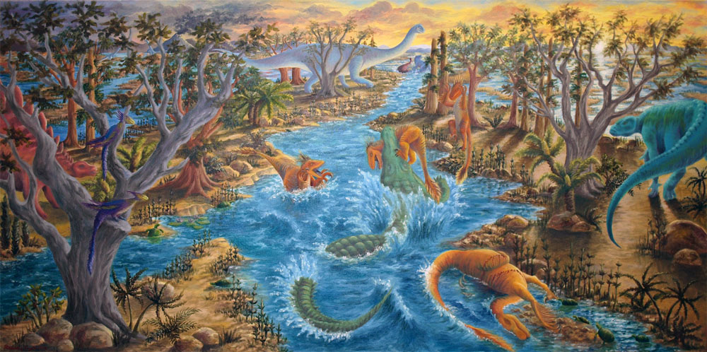
Las Vegas is located in a desert with summer temperatures reaching over 110 degrees, but it wasn’t always this way. Seventy million years ago, it was a dinosaur-infested flood plain. An accurate depiction of the Las Vegas area during the Cretaceous era lives in the Nevada State Museum of Las Vegas. Tiffany Pereira, a scientific illustrator, created the scene with help from paleontologists and museum curators to ensure it is scientifically accurate.
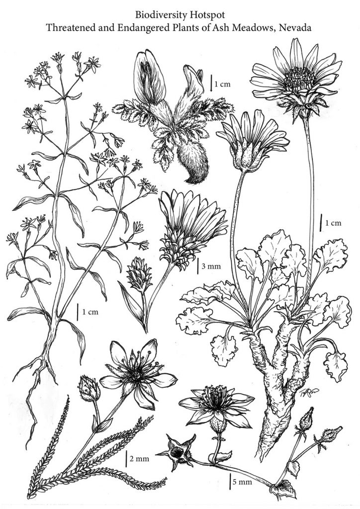
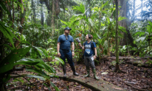
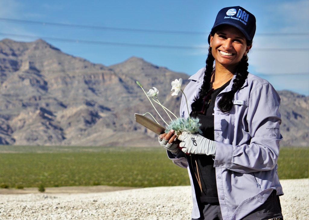
Tiffany Pereira is an assistant research scientist and ecologist with the Desert Research Institute. She is currently in the field working on a Desert Tortoise Vulnerability Assessment in Tule Springs Fossil Beds National Monument, which essentially means she is documenting every Desert Tortoise occupying the park. Pereira is also an artist, and she combines art with science to create illustrations that communicate science in an understandable and aesthetic way.
What is scientific illustration?
Scientific illustration has been a key aspect of science communication for centuries. “Scientists like Charles Darwin didn’t have computers to help document their findings. They had to write it all down, and often those documents contained illustrations in order to describe the work and the findings,” explains Pereira. “Darwin himself illustrated his findings in The Origin of Species. He drew Finch beaks to document what he was seeing and what he was noting.” Photography wasn’t a technology that was available at the time, so those illustrations helped communicate Darwin’s findings to other researchers in his field.
Not only did science illustration help Darwin communicate findings to other researchers, but it helped him communicate his findings to a wider audience – to the public. “In an essence, scientific illustration was actually fundamentally responsible for communicating the science – for getting the word out there. And without it, [Darwin’s] research would not have had the audience that it did at the time,” says Pereira.
This concept has stayed true to this day. Have you ever read a scientific article that was full of scientific jargon that you didn’t understand? Did this complicated scientific jargon make you more interested in the topic, or less interested? Most likely, the article lost your interest fairly quickly, causing you to stop reading it – and that’s not your fault. The whole point of science communication is to make science accessible and understandable to anyone – regardless of their scientific background.
“It makes much more sense to have a graphical abstract at the beginning of a paper than a block of text that’s full of jargon that no one understands or wants to take the time to read,” explains Pereira. Illustrations, infographics, and other creative ways to present information are key in communicating science.
Scientific illustration today
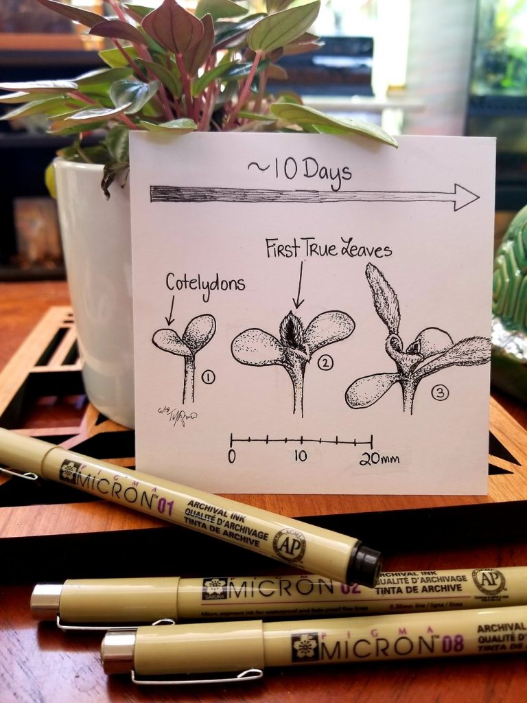
With the recent developments in technology, science communication is becoming an increasingly broad field. Science communication takes place in video format, podcasts, online articles, social media posts, graphic designs, photography, and even virtual reality. But just because we have constant access to fancy cameras and high tech animation software, doesn’t mean science illustration is going to take the backseat. “It’s really hard to capture texture and depth in a photo,” says Pereira. There is technology today called stacked photography, where a photographer takes photos focused at different depths, then merges the photos into one, to create a photograph that is focused all the way through.
But, “traditionally it’s hard to have something that’s focused all the way through,” explains Pereira. “When you’re zooming in on the anthers of a flower, the rest of the flower is going to be out of focus, which isn’t all that helpful. So illustrating allows you to hone in, create something that’s in focus all the way through, and also it allows you to pick up on the texture.” In a photo, if you don’t have the right angle or lighting, you can’t capture the roughness or fuzziness of a plant’s texture clearly.
Another field where science illustration is heavily utilized is medicine. “You can’t take a picture of all those organs because sometimes they’re sitting on top of each other. So you have to pull them apart, and illustrations allow you to have a panel where you can have different things on it, and see it all together to make those connections.”
Combining art and science
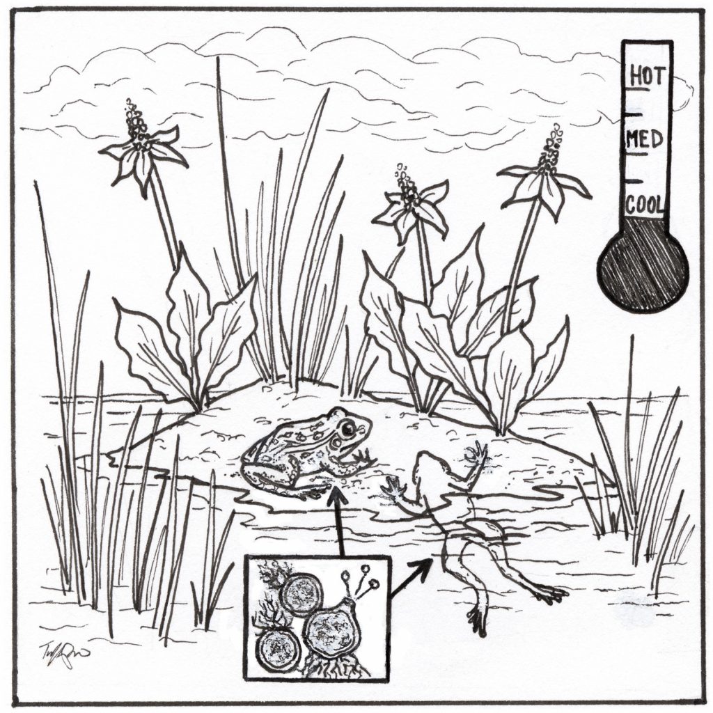
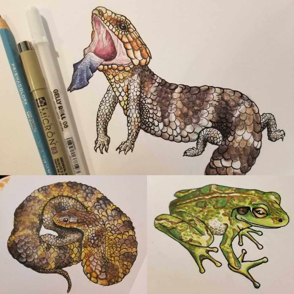
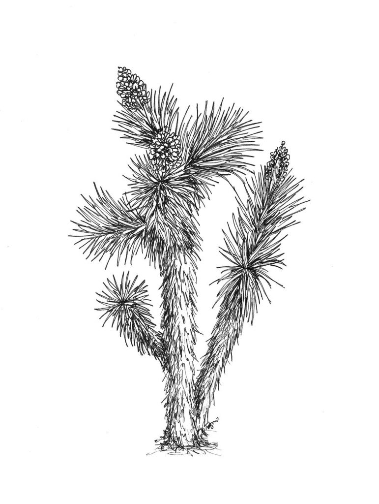
Pereira does most of her scientific illustrations with pen and ink, but she is working on improving her technical skills on the computer, so she can start transferring illustrations to digital. “I am starting to take my line drawings and scan them in, and I’ll do editing or touch-ups, or I’ll add elements to it in a digital format. I learned in pen and ink, so I’m trying to challenge myself to get better in the digital format.”
When Pereira was just learning how to illustrate in pen and ink, her teachers discouraged her from pursuing both science and art as a career. She wanted to double major in a science field and in art, but her teachers weren’t supportive.
“I actually got push-back from the art school who assumed I would put more time into my labs than my art class. I was so turned off by that, I did a minor instead.”
Despite what may seem like a setback, minoring in art rather than majoring actually led to some incredible opportunities. She earned second place in the Fine Arts Division at the Undergraduate Research Symposium at USC for her project incorporating the environmental justice work on the LA river for her major with the printmaking, photography, and line drawing work for her minor.
“They had just never seen a project like that,” says Pereira. She wanted to show the world that you don’t have to choose between your two passions. “It was a little bit of sticking it to the man, but a little bit of just not wanting to choose which one of my two passions I had to pursue… so I just said – why not both?”
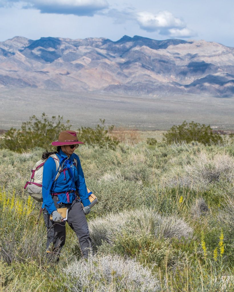
Pereira has taken that mentality to heart, and she has developed quite the career for herself. As a scientific illustrator for the Desert Research Institute, she has a long-term goal of creating a botanical inventory of every single plant at the Tule Springs Fossil Beds National Monument, where she is currently conducting field research. This is a massive undertaking. “You have to cover as much of the monument as you can, but specifically different elevations, different areas, different soil types. And we have just under 200 species in the monument alone,” says Pereira.
Pereira’s goal is to create a manuscript that allows people to see illustrated depictions of all the species present, similar to the National Audubon Society’s Field Guides. The Audubon Society creates and sells field guides to birds, trees, butterflies, fossils, fish, mushrooms, reptiles, rocks, trees, flowers, seashells, and numerous other science-based identification topics. All of these field guides utilize scientific illustration to aid in communication.
The future of scientific illustration
With today’s technology, science illustration can vary from the pen and ink illustrations that Pereira specializes in, to graphic illustrations and animations created entirely in a digital format. The future of scientific illustration has a broad array of creative possibilities combining varying tools of technology. “It’s amazing, the emphasis on communication of science, and how science can be communicated in so many different formats,” says Pereira.
And with the advent of social media, scientists have an easy way to share their work with the world and engage their community. “I think more and more scientists are embracing that they can’t just reside in these echo chambers. They have to work at getting their message out in a way that’s more accessible,” says Pereira.
But not all scientists have the creative skills to visually communicate their work, and not all scientists want to spend the time engaging in that aspect of their work. That’s where specialized science communicators come in. Pereira has clients that she creates visual content for on a regular basis.
“I have a couple researchers that will poke me whenever they have a figure that they need done. I’m like their personal illustrator. It’s wonderful that more scientists are thinking about this, and we’re here to help them.”
