Scientific ideas are often complex, technical, and difficult for general audiences to understand, and communicating these ideas effectively requires more than words alone. Visual storytelling, including animation, motion graphics, and immersive media, can help translate this complex scientific information into clear, engaging narratives that audiences can quickly grasp. As scientific research increasingly reaches the public through digital platforms, visual approaches are becoming an important tool for science communication.
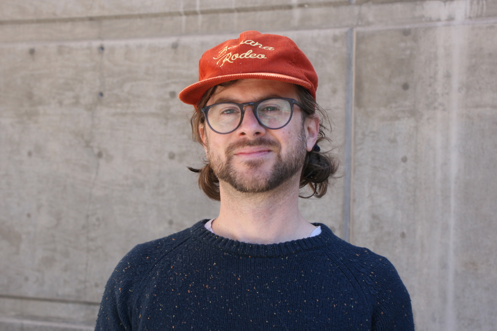
To explore this growing role of visual storytelling in communicating complex ideas, I spoke with Luka Starmer, a multimedia technologist and visual storyteller at the University of Nevada, Reno. Originally from upstate New York, Starmer moved to Reno after spending time in Lake Tahoe and later joined the Reynolds School of Journalism’s graduate program, where he focused on immersive storytelling and multimedia production. Before entering graduate school, he worked in public relations and grant writing for nonprofit organizations. Today, he teaches a motion graphics class at the Reynolds School of Journalism and manages student digital media technology at the University of Nevada, Reno Libraries, while continuing to explore virtual reality and other innovative approaches to multimedia storytelling.
During our conversation, Starmer discussed how motion graphics and animation can simplify complex information, the importance of balancing visual creativity with scientific accuracy, and the ethical responsibilities that come with producing visual explanations of scientific research.
Q: Can you briefly describe your background and how you became interested in visual storytelling?
Starmer: I work in the @One as the manager of student digital media technology in the University Libraries. Our team here knows our way around many multimedia software and hardware technologies to be able to support students with their different digital projects. This includes things like 3D and virtual reality, photo/video, audio, and motion graphics. Before working in the libraries, I finished a graduate program at the Reynolds School of Journalism, where I did my master’s project in virtual reality. That is where I cut my teeth in programs like After Effects for motion design and storytelling. I’ve also taken on many freelance and personal projects in the realm of motion graphics and art. Each professional project makes me a better designer, animator, technologist, and teacher.
Q: Why is visual storytelling such a powerful tool for communicating complex ideas?
Starmer: When the Reynolds School asked me to teach motion graphics, the class had already been established for a few years. I was able to understand previous syllabi and adapt them to my own teaching style. From a pedagogical approach, I truly believe that learning the specifics of software techniques — really understanding how a software works — is the most important for new students. The students are asked to become artists. They need to make all of their own digital assets before they can even make them move. This means they need to understand graphic design, typography, color, texture and beyond. I match all of that with vocabulary and theory of motion design so that creators not only know what they’re trying to accomplish, but how to describe it and why it’s effective. Students are combining multiple softwares to make their assets, from After Effects to Illustrator to Photoshop to their iPads. Some students are shooting photography and videography in addition.
All of this technical learning happens completely separate from any “journalism” or reporting at first. It’s too much to ask someone who is brand new to motion graphics to also wear their hat as serious reporters. The first entire half of the semester, the motion graphics class acts more like an art and technology class than a journalism class. They are still engaging in storytelling, but it’s more about the motion graphics techniques than the context.
Once they’ve gotten the reins on the software, the artwork, and making it all move — then we switch to applying it to complex ideas.

Q: What makes visual storytelling especially effective in science communication?
Starmer: One term that the students become familiar with is “abstracting.” Abstracting refers to simplifying real-world objects or concepts into basic non-representational elements—such as shapes, lines, colors, and textures. For example, if the narrative says that something affects 10 percent of the human population, rather than showing people, a motion designer may animate 100 circles onto the screen, and ten of those circles will turn red. Circles have nothing to do with people, but tied with the narrative, the audience will be able to visualize the dataset and its scale.
Students don’t need to be phenomenal artists to be successful science communicators.
Another example would be when animators anthropomorphize elements of their narrative. Sometimes they put a little face on a simple illustration of a bacteria, or something microscopic that is difficult to imagine. This turns the scientific subject matter into a character, and now the audience can understand the behaviors in a more metaphorical narrative approach.
Visual storytelling allows for data and narrative to be quickly digestible and understandable when tied with strong factual script writing.
Q: How do you ensure that scientific visuals remain accurate while still being engaging?
Starmer: Last semester, I mandated the students to develop their final motion graphics projects around science research that is happening at the University of Nevada, Reno. I had them dive deep into the topic, the researchers, and the data. I also asked them to contact the researcher or someone involved with the topic, such as a graduate assistant. These interviews became primary sources in addition to the secondary research that was already published. This helped the animators understand their topic thoroughly. As they scripted, I had them cite their source for every claim they made or every dataset they drew from for easy fact-checking.
The most important thing in a science explainer is having the script be factual and accurate. However, sometimes the animation is not accurate on a granular level, but still visually communicates the data. For example, if there is a graph that trends upwards based on thousands of data points, the animator can simplify the data so that it still shows an upward graph, with appropriately labeled axes, while being more visually interesting and concise. Paired with an accurate description in the script, the audience will understand the narrative, even if the animation is simplified.
Sometimes when students encounter published peer-reviewed papers, the datasets are so technical and scientific that they are difficult to understand. Those published findings are not for the layperson; they’re for scientific peers and academics. It’s the students’ jobs to be able to make those findings understandable creatively, artistically, and effectively to their audiences. It’s a careful balance of keeping the reporting accurate and technical while making it simplified and artistic.
Q: What role do visuals play when scientific information is misunderstood or misrepresented online?
Starmer: Like all content, a visualization can be misleading, either in error or in malice. The power of art and motion graphics is the attraction to the eye and engaging style of reporting. The tools for design and animation have gotten ever easier, especially in the age of artificial intelligence. Because this is a journalism class, the students are committed to fair and accurate reporting. I draw on the strong ethical foundations that are instilled in them by the journalism faculty in the department.
The final project in my class works like a newsroom: They learn as much as they can on their topics. They develop sources. They write and re-write their scripts until they are factual, concise and informative. They develop their assets and record their voice-over narrations. They bounce many versions of their drafts off each other and me, constantly tweaking up until the time of submission. They diligently cite their sources for easy reference and fact-checking. The Hitchcock Project supports the fact-checking process, too. These animations are vetted many times. Once they are submitted, they are reviewed and evaluated by the Hitchcock Project for possible publication — a very honorable accolade for these student projects.
An animated explainer about the science of sunsets by Reynolds School student Khushleen Khera, who was a student in Luka Starmer’s motion graphics class during fall 2024.
Learn more
To view the explainer videos that have come out of Luka Starmer’s motion graphics class, please visit: https://hitchcockproject.org/explainers/. The Reynolds School of Journalism’s motion graphics course will be offered again during the fall semester of 2026.
Abdulmalik Adetola is a master’s student in the Media Innovation and Journalism program at UNR and a graduate assistant for the Hitchcock Project. He is a passionate advocate for health literacy and digital communication, dedicated to promoting accurate and accessible health information in the modern age.